ShopDreamUp AI ArtDreamUp
Deviation Actions


Suggested Deviants


Suggested Collections


You Might Like…


Featured in Groups


Description
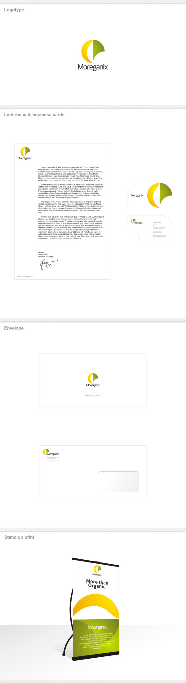
this logo was made for an organic company hence the name Moreganix
the name and logo are all created by me and the font is a modified version of another font
the logo was made to resemble two leaves with an accent on the colors to connect with sun colors/ideas and green/organic products
the logo is also used to create visual elements like the cutout on the business cards and the 90 degree rotated version found on the print(the one at the bottom) that was used as a more or less abstract illustration of a hillside+sunrise+green field
with the right kind of marketing i think this logo has a lot of pottential when it comes to branding - what do you think?
enjoy!
please do not use this in any way,
all rights reserved
Image size
600x2206px 271.61 KB
© 2010 - 2024 mircha69
Comments30
Join the community to add your comment. Already a deviant? Log In
So in looking over your explanation of your branding package I thought I'd leave a few comments to maybe push your thinking a bit.
Let's start with the name, which I'm assuming this is all fake so why not. What does this company do? What service or product do they provide. Moreganix sounds processed with the X maybe Moreganic. With that I think you have the idea of "more organic" that could be a jumping off point.
Moving on to the logo. I personally wouldn't have never gotten that those shapes were suppose to represent 2 leaves. I think it is too abstract/contemporary. Is it suppose to look like an 'O' for organic? How does this icon relate to the name Moreganix (which again sounds processed.) Regarding the font there is a tension between the smoothness of the icon and the digital feel of the font that isn't working for me. Look at a few other organic/green companies and see the range of ideas there.
The diecut on the business card feels awkward to me I think you're taking away from the cut around the logo by having the rounded corner on the top left.
With the stand up print piece I wouldn't have gotten the sun on the horizon idea. Using the logo as a design element is tricky which is why most companies shy away from it. I think you could do it but you'd need to refine your design more. The first step would be not laying copy over the logo it's a bit distracting.